


Content Strategy Projects

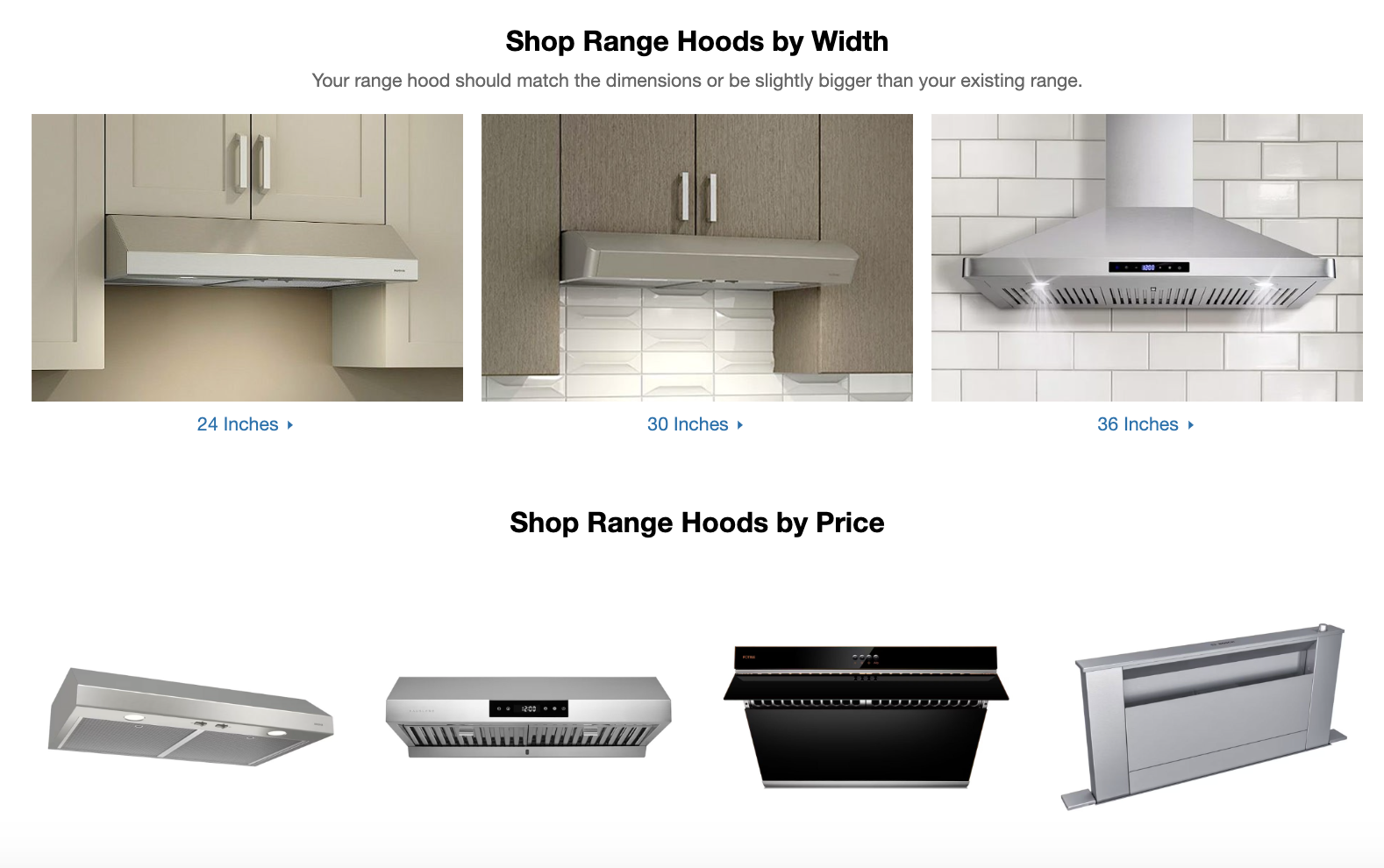
Category Landing Page Range Hoods

Challenge
Range Hoods is a complex path to purchase, making it difficult for customers to know exactly where to start. I was tasked with creating a net-new category landing page that simplified decision-making and helped guide users toward the right product as quickly and easily as possible.
Solution
I analyzed on-site browsing behaviour, focusing on the most frequently used filters and interaction patterns. This revealed how customers evaluated their options—typically by type, then size, and finally range. Using these insights, I designed a landing page that mirrors this decision-making flow, highlights the most important information up front, and helps customers quickly find products tailored to their needs.
Impact
The redesign created a more intuitive shopping experience, reducing friction and helping customers reach purchase decisions with greater confidence.
Category Landing Page Kitchen Cabinets


Challenge
The existing landing page had to explain a complex product offering—four assembly types across three vendors—without overwhelming customers. At the same time, it needed to keep homeowners engaged and inspired during a high-stakes renovation decision.
Solution
I used visual storytelling to simplify complexity while sparking inspiration. The refreshed page featured intuitive product carousels, custom infographics to break down assembly types, and a clear callout to the kitchen estimator tool. Together, these elements guided customers step by step through their options with both clarity and confidence.
Impact
The redesign drove a remarkable 230%+ increase in page traffic after launch, proving the value of pairing clear information design with inspirational storytelling.

Wordpress Site Kirkland Lake & District Tourism


Challenge
Seven distinct communities in Northern Ontario needed to be promoted as a unified tourism destination. The regional board wanted a cohesive brand and website that celebrated the district as a whole—without losing the unique identity of each town.
Solution
I designed the site architecture around experience zones (Ice, Snow, Water, Land) rather than municipalities. This activity-first approach let visitors explore the region by landscape and season, highlighting each community’s strengths while encouraging cross-district tourism. Alongside the UX strategy, I created a logo and colour palette inspired by natural elements, built out directories for accommodations, dining, and events, and incorporated drone footage to capture the area’s beauty.
Impact
The result was a unified digital destination that balanced regional cohesion with local character, making it easier for travellers to plan trips and inspiring tourism across all seven communities.

Shopify Store Tori XO Jewellery


Challenge
Tori XO, a handmade jewelry brand with over 100 SKUs, needed a Shopify 2.0 storefront that could handle a diverse catalogue without overwhelming customers. The goal was to create a shopping experience that balanced clear navigation with brand storytelling.
Solution
I designed flexible paths to discovery, enabling customers to browse by type, collection, or budget. For intentional shoppers, I implemented a refined “Shop by Type” filtering system to make narrowing down quick and intuitive. To bring the brand’s personality forward, I built curated collections and visual lookbooks that showcase craftsmanship and aesthetic.
Impact
The result was a visually cohesive, user-friendly storefront that made product discovery seamless while elevating Tori XO’s unique brand story.
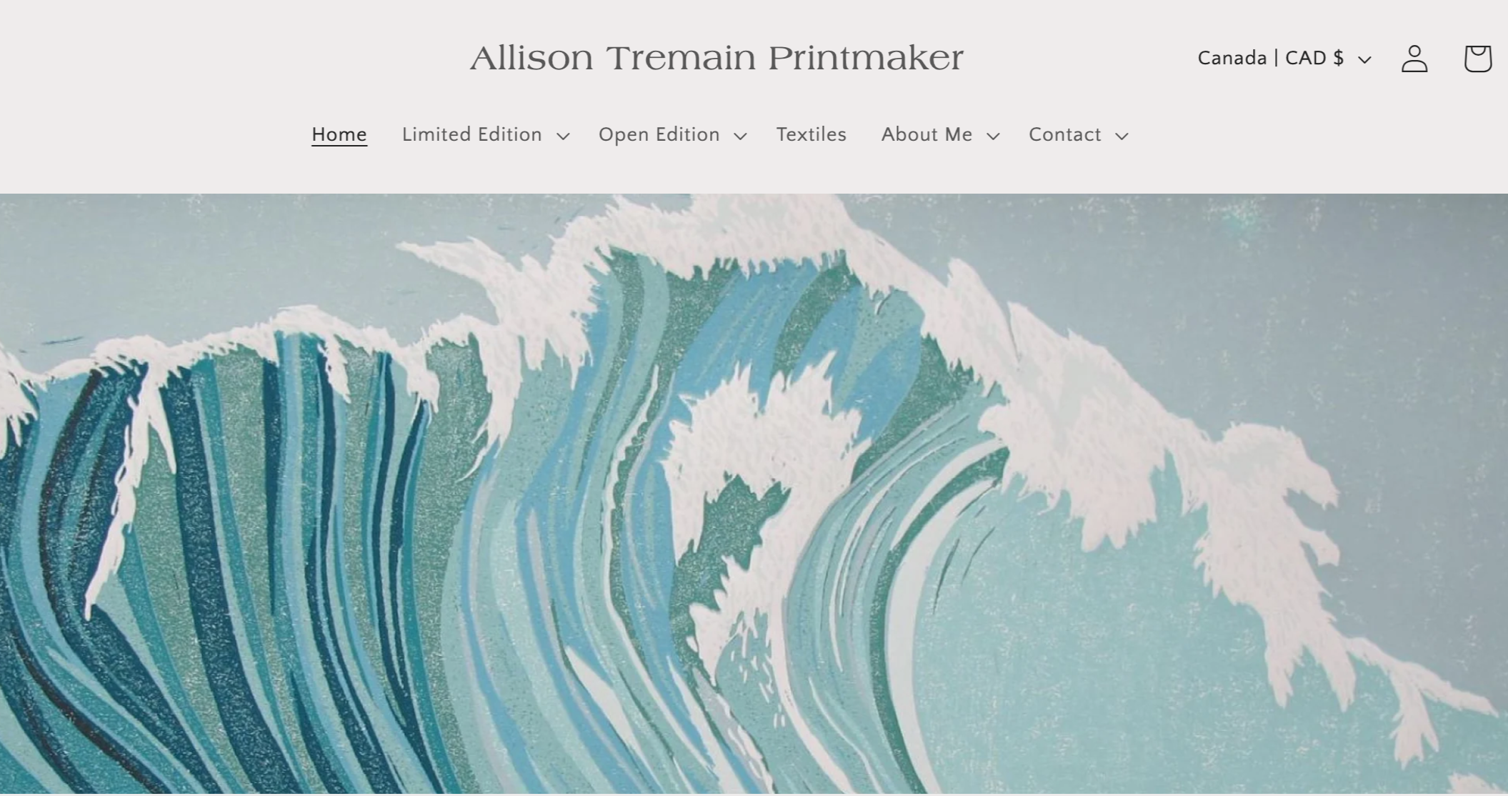
Shopify Store Allison Tremain Printmaker


Working with artist Allison Tremain was a rewarding lesson in designing with intention, even on a tight budget. As a recipient of a Digital Main Street grant, Allison came to me with a big vision for her online store—but limited resources. Using a free Shopify theme as the foundation, I created a storefront that highlights the beauty and variety of her artwork while keeping the experience streamlined and accessible.
To make her large catalogue easy to navigate, I organized products into collections based on shared visual elements, helping customers connect with pieces that resonate with their personal style. I also implemented practical filtering tools that let users quickly sort by availability and price—ensuring a smooth, satisfying shopping experience without unnecessary complexity.
The result is a simple but elegant Shopify store that allows Allison’s work to shine and customers to shop with ease.

Wordpress Site King Soundworks

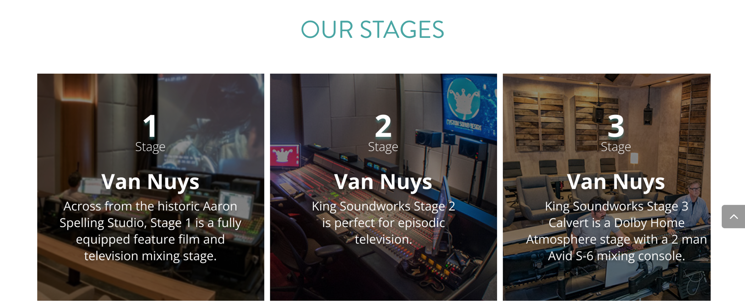
When Greg King reached out, the King Soundworks website hadn’t been updated since 2013 and was due for a modern refresh. The original site was spread across multiple landing pages, making the experience fragmented and overwhelming. The challenge? Condense years of work and information into a single-page site without sacrificing clarity or impact.
To solve this, I restructured the site using anchor-based navigation that guides visitors smoothly through the brand’s story, services, and portfolio—all from one streamlined page. I incorporated image carousels to showcase their award-winning work without clutter, and refreshed the color palette and typography to reflect a more modern, cinematic feel in line with their industry. The result is a sleek, scrollable experience that captures the essence of King Soundworks in a format that’s fast, functional, and visually compelling.